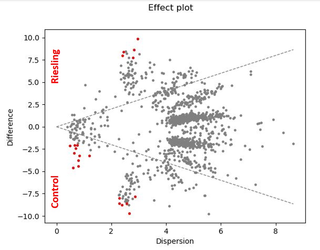
I ran aldex2 on my data and got some nice effect charts and tables. Unfortunately, I don't understand what the table is telling me. I understood that each red dot in my effect diagram shows a significantly different ASV (not in test1), but I can't link the table to it.... Can you help me?
You probably found this already, but I wanted to make sure I provided the link to the ALDEX2 qiime2-plugin and to the part of the vignette that explains what all those outputs mean. (Those are the columns in your test1 and test2 tsv files!)
As mentioned in the vignette, the values of your Control and Riesling group are listed in that table, along with the mean difference in value, p-value, and corrected p-value for various stat tests on each feature.
Let me know if you have specific questions and I can tell you more!
thank you very much!
It is getting a little bit clearer now... But when I look at the corrected p-values, only some of the features are significant, even though they are all shown as red dots in the effect plot? Is that correct?
It is not quite clear to me yet, how to read the values of my Control and Riesling group in the table (sorry!!). Is there an x and a y value for each feature? So that I can find it again in the effect plot?
I would like to label the y-axis as in the attached image in red. Is this even an option, or is it not possible to generate these statements with this table?
I had to look up the code to make sure I was also getting it right. You can check my work:
Those plots are all separate .png files, so you can save them one at a time. Is that's what you mean?
You could also replicate these plots directly in Python or R if you need more control.